
I want to make it clear that this is in no way a slight or diss at designers. In my opinion designers nowadays are better than ever and should be given more freedom to make their schemes.
Paint schemes are a distinct part of NASCAR racing that every person who has watched a race or seen a NASCAR racecar has seen. Many are timeless and iconic but there are other that are complete stinkers as well. Nowadays it feels like we tend to have these kind of paint schemes more and more without as many of the iconic ones that fans flock to. So we are going to look at how NASCAR has changed stuff up over the last decade or so. What happened to (many) NASCAR paint schemes?
Visit the New Merch Store Here:
Video Credits:
Coca-Cola
Hendrick Motorsports
Idk Player
Joe Gibbs Racing
NASCAR
NR Cup Series
NR Night In America
scottjohnson
Stewart-Haas Racing
Team Penske
Trackhouse Racing Team
YouTube Audio Library
Thumbnail Credits:
Hendrick Motorsports
Outro Song:
Strang Animal (Crowder Remix) by Gowan
Songs:
Cold Funk – Funkorama by Kevin MacLeod uploaded to the YouTube Audio Library
#nascar #motorsports #racing
38 comments
What are your thoughts on many modern NASCAR paint schemes?
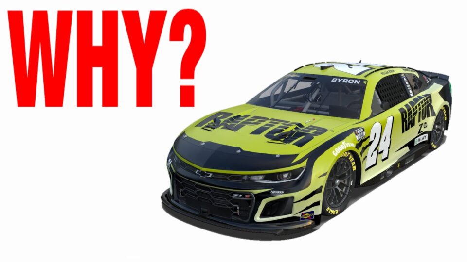
They’re trying their best I like Byron’s Raptor/Axalta/Liberty cars
William Byron’s for this year aren’t great to say the least
Numbers needs to be moved back to its original position
@@Dupontman627ofc you do you meat ride the 24 car
I like them, I actually like the number placement in the front it’s made some cars look better in my opinion (some examples are the the monster energy cars and the JTG cars in my opinion)
The schemes that we see nowadays are clearly less iconic. In 10 years time, no one is going to say “Yeah, the Raptor driver!” when talking about William Bryon.
But maybe axalta??
When they talk about Logano they will call him the Pennzoil driver, Bell will be the Dewalt driver, Elliot will be the NAPA driver
@@Isaac43. Those drivers have had those sponsors for a long time and they sponsored around half the races last year. In 2023, Bryon’s Axalta sponsorship barely covered half the schedule.
What about denny hamlin with fedex
@@TheUncancelable1 True. Denny Hamlin has been with FedEx for years.
It’s not the designers fault at all. The sponsors and sometimes even the teams have strict guidelines on how they want their respective company to be promoted
I think the best thing that Sam Bass and Jeff Gordon had going for him was DuPont Automotive finishes as a sponsor to work with. DuPont wanted their product/name on display and Bass could use as many colors in a design as needed.
I don’t really have a gripe with the paint scheme. I have a gripe with how many there are. I remember when one paint scheme would be used for every race with the exception of one to three races, being special or throwback races. It’s just too hard to keep track of everything now.
Unfortunately I don’t think designers have too much say when it comes to the designs on the cars. But modern paint schemes are dull because that’s what companies want right now. If you notice lately, a lot of companies have rebranded to a more minimalist, basic style than something eye catching and unique.
I think there should be a race event every year where designers have full freedom to put what they want on the cars, or have fans vote on what the paint schemes should be for the following race.
Even with the number being moved to the front, I know that there is potential of amazing paint schemes
Yes I agree with that statement. All I could think of is if Target was still in NASCAR for a huge Target on the door and the name in smaller font and then the hood and deck lid with the bigger Targets on it. Then someone going to take Juan Montoya out or collide with him (yeah I know not in the sport anymore)
Livery is different than what NASCAR does. F1 does awesome paint schemes to attract sponsors. NASCAR does the paint schemes after they get sponsors.
It’s not exactly that way with F1. F1 liveries are still heavily affected by sponsorship, like BWT insisting on their corporate pink on Alpine metallic blue cars. Or lime green Kick logos on crimson/black Alfa Romeo cars. Looks hideous, but the teams need money.
Speaking of black – it’s another big problem with current F1 liveries. Many teams tried to save weight and left big chunks of carbon unpainted. Alpha Tauri, Williams and Mercedes looked barely different from the distance. McLaren, Haas, and Alpha Romeo had huge black carbon parts as well.
And, it’s almost a given thing that new-ish F1 fans hate Red Bull livery, the most iconic livery in the current field if we don’t count Ferrari.
I wonder how they would react to McLaren Marlboro livery that stayed the same from 1974 to 1996.
@@st.gallenthegreat4027 I get where you’re coming from, but the 1974 livery bore little resemblance to the 1996 one barring the colours. Still both recognisable as Marlboro McLaren. 1981 (the start of the MP4 era) is when the iconic livery was first used.
I always loved the bobby labonte green, black and red interstate batteries Pontiac grand prix. Such a cool paint scheme.
Another thing to mention is some teams have a design they use on all of their paint schemes track house is good example of this so some companies colors will look very good on it and some will look weird
Can’t blame the designers. They’re being forced to kiss up to corporate bs and help exploit advantages for the teams. Modern paint schemes diminish the aesthetic and fan relatability elements
Not only does the sponsor needs to get their heads out of their butts and recognize Talent when they see it, but they also need to make sure that it stands out for every single race in every single season that are on board. We need one sponsor to one car, and keep it that way (if you want to show off an associate sponsor, then do something that Menards or Napa does and keep the base primary scheme virtually the same).
Honestly, I think it comes down to 3 things: The sponsors being picky, the teams needing to find an edge, and the simple fact that there are far more sponsors per season on a single car than there used to be.
Back in the day, when there would be almost, or completely exclusively one sponsor on a car, it was easy to pick out and recognize, and if even if you might not like a scheme at first, if you see it every Sunday for 30 weeks, it’s going to grow on you. That’s why, even to fans who weren’t around for the 90’s can easily recognize the Earnhardt and Gordon cars for example. But, nowadays, there’s just so many sponsors for most teams that even if a scheme is fantastic, most will forget about it by the end of the season. Not to mention the fact that tech inspection back then didn’t involve laser measurements. Teams now have to fight harder for less, and unfortunately, there’s no real way to ban OSS manipulation.
I do disagree though with the “Paint VS Wrap” thing, because really, I can’t tell a single difference between identical schemes. Also doesn’t help that the example given was pretty poor considering it’s full day lighting VS night with a bunch of giant lights pointed at it. Maybe in real life it makes more of a difference, or maybe I just don’t have the taste so to speak, but I have to go off what I can see, and what I see is negligible.
I’ve done some work with paint and the best way I can explain it is that you can put a different type of top coat on the paint to make it shine better with a gloss coat, it keep some areas dull with a matte coat. You don’t get these effects the same way you do with wraps, they’ll have the same color but they wont have the same finish as paint would
I think it’s time for nascar to adopt a similar formula to the likes of open wheel and sports cars. As much as I wished to see the continued potential legendary paint schemes, with the reach not being as strong in pop culture like it used to be, I think it’s time to start raising the Team’s brand again. Yes, not the drivers, but the teams. Drivers come and go, but teams tend to stay longer than the average driver. Before the days of big cigarette money and heavy sponsorship dollars, teams branded themselves or a local shop nearby. How it ends up looking like, not quite sure, but the numbers placed where they are right next the team logo on the side is a good start, like trackhouse’s test car. The HMS platinum schemes come to mind as a similar level effort I’d like to see.
I actually like a lot of todays paint schemes better. 23II and trackhouse have cool schemes. The only ones I don’t like are the half car one scheme/sponsor and then half the other scheme/sponsor (Ricky Stenhouse)
One thing that has also gone away in the next gen era are colored rims. I can think of a couple paint schemes that would look miles better if they had colored rims to match a certain part of the car. Logano’s Pennzoil paint scheme comes to mind.
Colored Wheels haven’t gone away just teams haven’t been spending the extra money it cost them to have BBS coat the wheels they buy. I believe RFK had white ones at the test a few weeks ago
And Penske has polished wheels while most are black.
Other factor is too many brands are forcing people to use a matt wrap over a slick/shiny one and often ending up a minuet issue of drag sometimes for the worse NASCAR depending on track where new cars at the moment not as much can be done to change car up at all to get a different setup even from Shortrack/road track car to the intermediate 1 mile to 1.6 mile tracks even when NASCAR Needs at least 2 types of car setups.
Eric had something similar yesterday….. it was discussed about how some how designs might be an effort cheat the Hawkeye system. An idea of how to monitor this was ‘ a white vinyl patch ‘., over points where a concern was detected. We need to be careful or we could have Pocono 2022 at every race.
My biggest gripe with liveries is the use of pictures of a real thing rather than a simplified art version of it
Look at Reddick’s 2022 Cheddar’s scheme vs Busch’s 2023 Cheddar’s scheme, Reddick’s was just better with the stylised croissant fade, comparted to just a picture of a croissant. Another good example was Bubba’s 2022 McDonalds scheme with the stylised Bic Mac meal, they could have very easily just put a picture of the food, but didn’t and it looks better
As an upcoming paint scheme designer, this video knocks everything out of the park, modern schemes feel bland. However, some can stand out and look fantastic. With that said, teams should use paint instead of wrap, that would be great. I associate some schemes with drivers that I grew up with, like Dale Jr w/ Mountain Dew, Jimmie w/ Lowe’s, etc. I fear that fans younger than me won’t get to experience the same with some drivers on the current grid which is unfortunate.
I always associate Junior with the number 8 Bud car
It’s much harder to pick any one car out of the pack when teams have six to a dozen primary sponsorships/liveries. I also feel like enough can’t be said about day glow paint